
Designing an Effective Event Poster
With everyone looking at their phones all the time, it may seem quaint to talk about designing a poster for your event. It can be much more fun, interesting, and alluring to design digital ads or your website to get people to your event. However, posters can be extremely effective in conveying your event's message and include some key features (no batteries, no network, no screen) over a digital medium.
Let's walk through a poster I recently designed for a blood pressure clinic to understand what makes an event poster work.
The Event Name
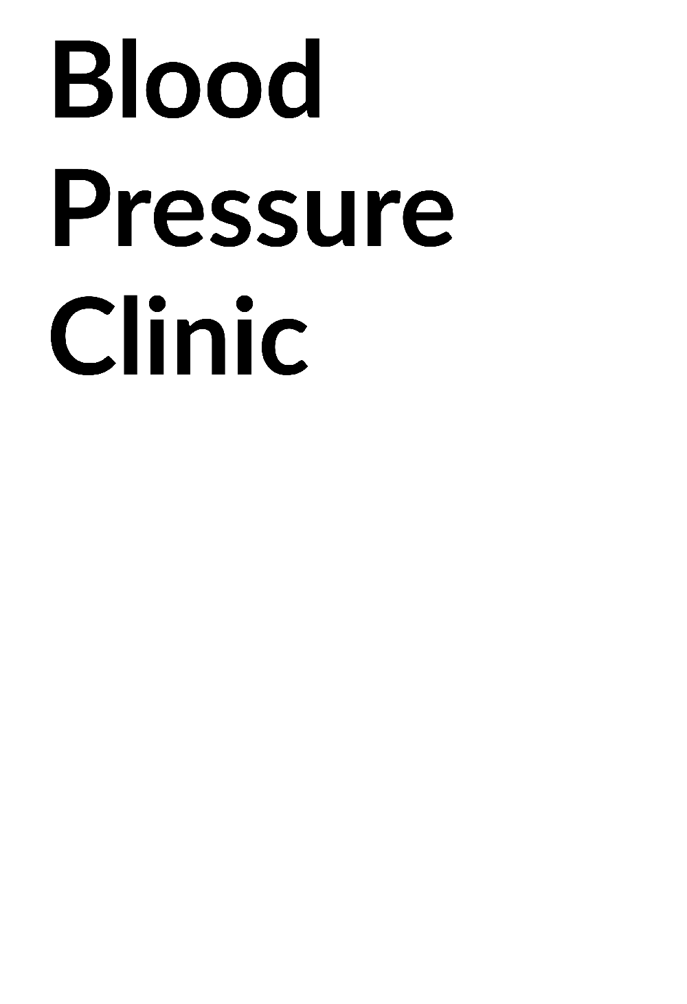
Starting with the most important element, the name of the event. This clinic is being held at a senior care facility, so we know the audience is elderly and may have vision issues. I started by making the event name bold and black, using a simple, highly legible font, and setting it on a very light background to ensure strong contrast and visibility.
Accessibility guidelines state that large text must have a contrast ratio of 3:1. This black-on-white is the strongest ratio you can get, coming in at 21:1. Obviously, that is at the extreme end, but I have seen quite a few poster designs where the heading can barely be separated from the background. You can check the contrast of your font against a packgroiund with a tool like WebAIM.
The choice of the font, Lato, is both an accessible and a design choice. Lato is one of the hospital’s brand standards, so it keeps the poster consistent. It is also a simple, sans-serif font. It may be fun — ok, really fun — to play around with fancy fonts like Dancing Script, Sarina, or Vast Shadow, but they will fight your audience's ability to discern your message.
Branding
Speaking of branding, I then integrated the OHSU School of Nursing logo. This is fairly standard to incorporate, as an organization like OHSU has well-developed brand logo guidelines. If your brand does not have standards, it is best to make sure you at least have the primary logo with the name in a legible font.
Value Statement
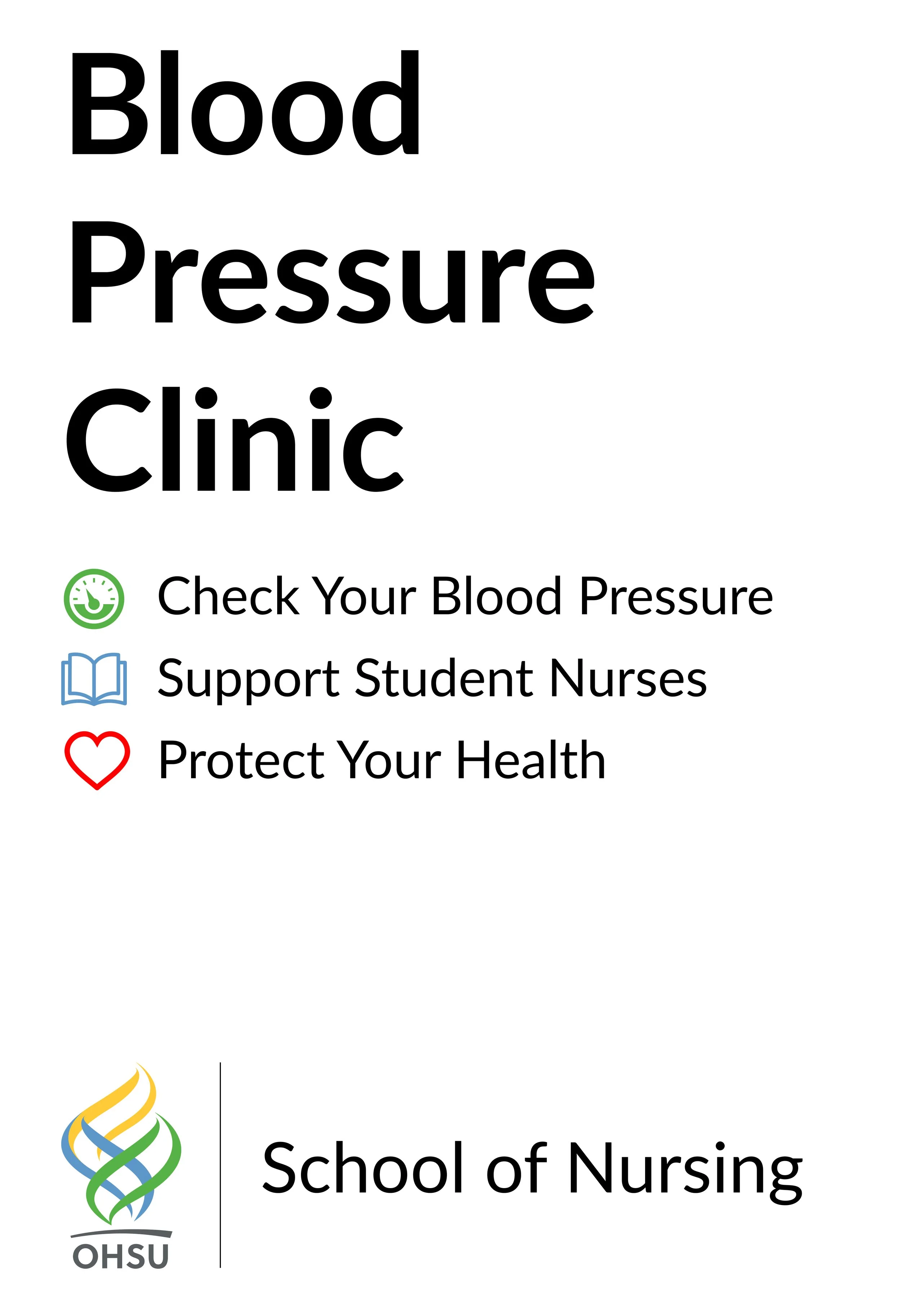
Next, I needed to incorporate the value proposition. A blood pressure clinic is a chance for people concerned about their blood pressure to get it checked by a medical professional outside of a medical appointment. This one is also an opportunity for nursing students to gain experience with real patients under the supervision of their school faculty. To communicate these needs, I integrated a simple list with representative icons. This will encourage potential participants to attend — not only for their own health — but also altruistically for the benefit of the students.
THE 5 W’s (Plus H)
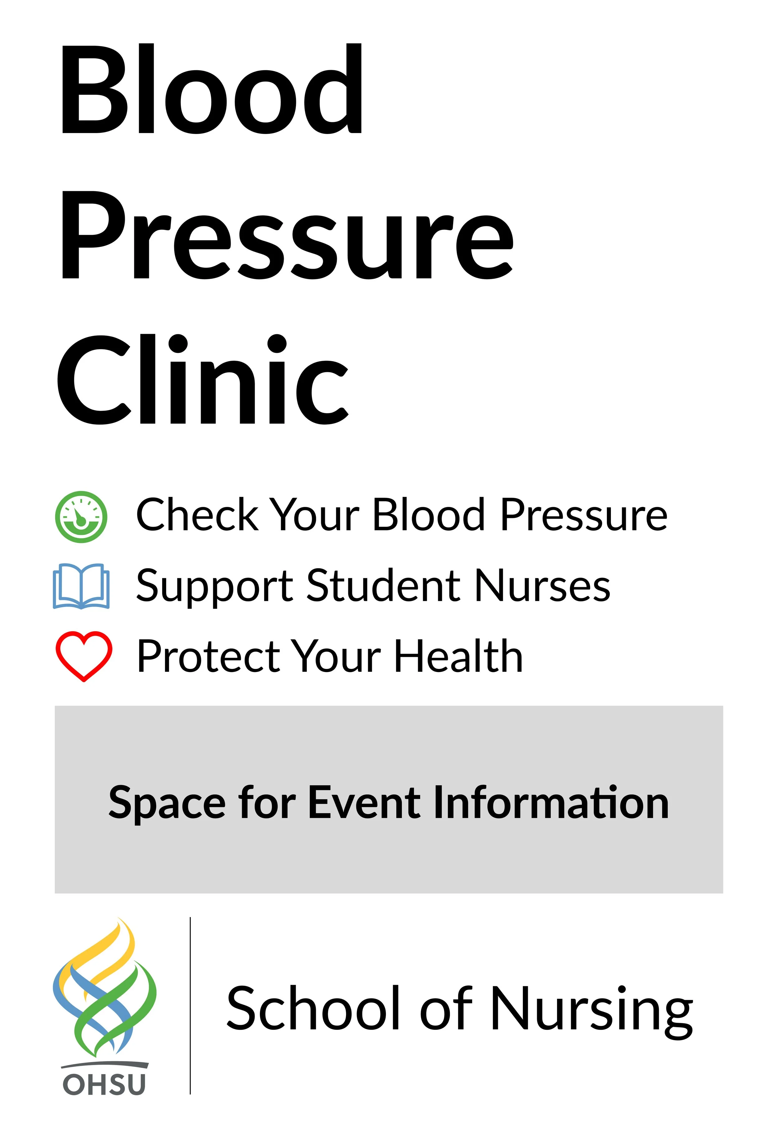
One thing you will not see on this poster is the vital "where" and "when" information. This was done on purpose as the intent is to reuse these posters over time. Instead, I left a space for that information to be added, either by taping a piece of paper to the document or by laminating the poster and writing on it with a dry-erase marker.
A touch of color
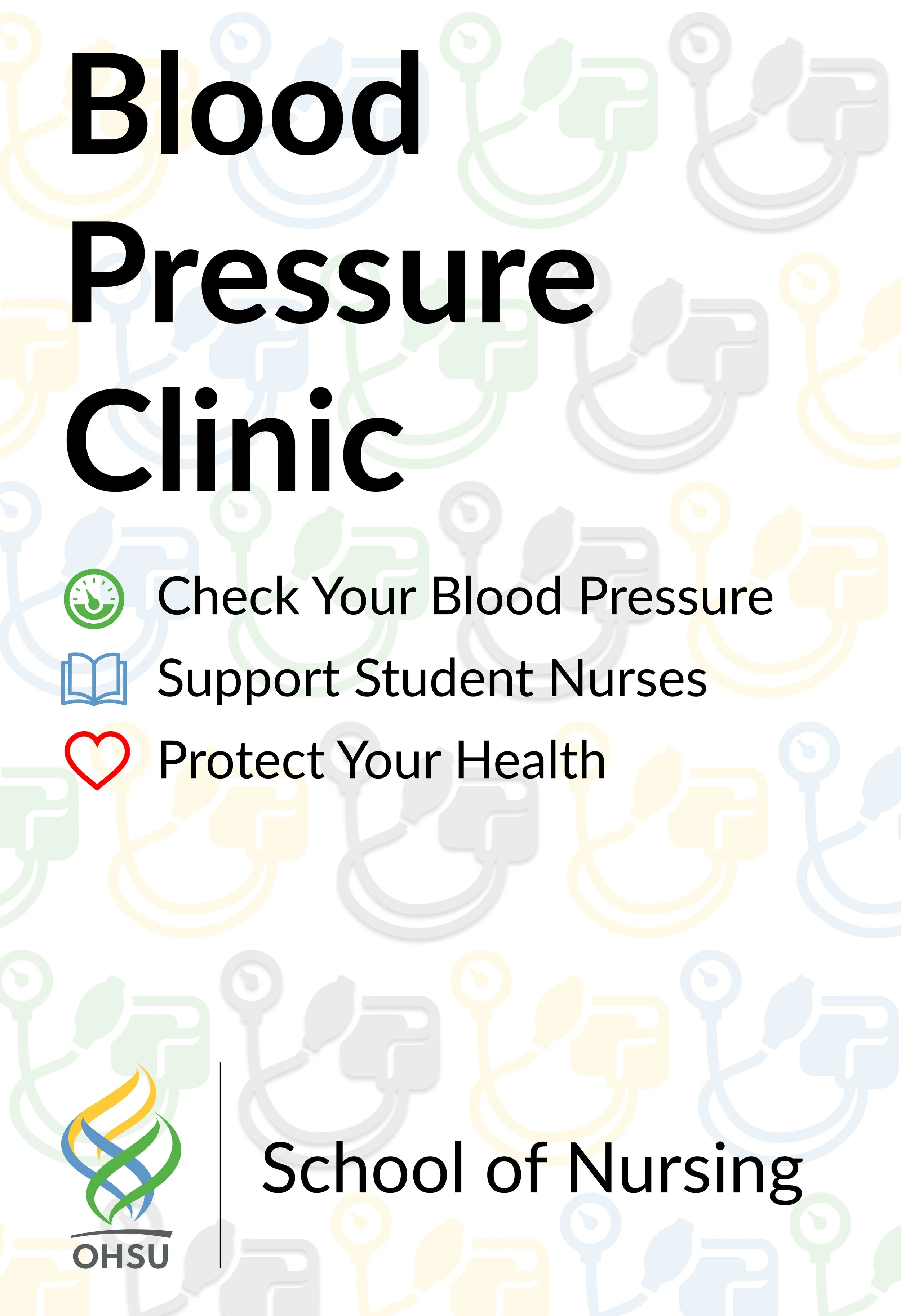
Lastly, having this information on a plain white background would leave it with a stark, informational feel. I wanted to add some color to increase its visual appeal. At the same time, I did not want to decrease the poster's legibility. To add this color and some fun to the design, I developed a multi-colored icon background featuring blood pressure cuff icons. This adds that final touch of personality to tie the design together.
When designing an event poster, it can be tempting to make it use a lot of color, fun fonts, and images. But it is more important to convey the poster's message to the target audience, creating a clear, concise message that informs and entices. If your audience finds it hard to understand what is going on, where it is going, when it is going, who is putting it on, and how it's being put on, you will be left wondering why you put it on.